
Key Pages of Successful Membership Sites
In this article, you will learn about the key pages of successful membership sites. Specifically, we’ll be discussing the following key pages:
- Membership Options (sales page)
- Signup Pages
- Login Page
- Dashboard / Account
- FAQ / User Manual
- Protected Content Pages
- Contact Form (for members)
Key Pages of Successful Membership Sites
Let’s hop into the key pages of successful membership sites – what they are, what to include on them and why.
Membership Options / Sales Page
When I made my very first full membership site, The Intentional Book Club, I completely forgot about having the main website link to a sales page / a page that described the membership and gave options. I was so excited about what was behind the gate (the login page) that I forgot about the fact that people who were brand new wouldn’t have a clue what they were supposed to sign up for.
Creating a clean, clear page that describes the membership space and what is included in different membership levels is extremely important to get users to go from just visiting the page to signing up (even if it’s a free membership or free trial!)
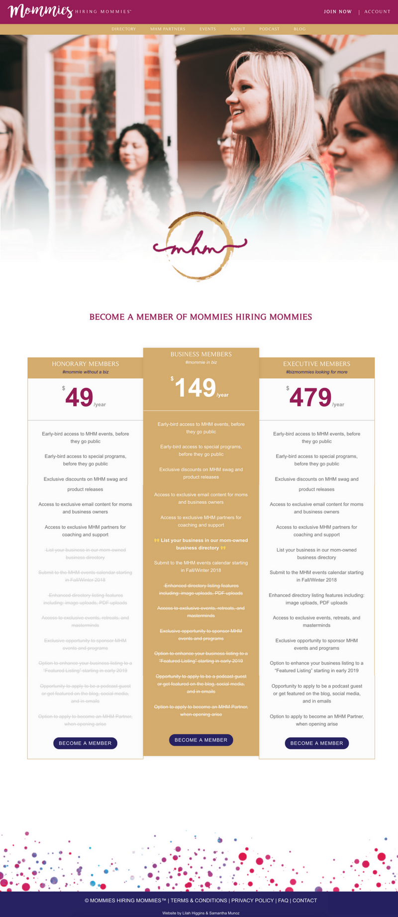
I am a big fan of pricing tables in general for all aspects of business, but for membership sites in particular it is so helpful to showcase what is included in their recurring fee. Especially if there are multiple membership options, highlighting the differences (and even which is the most preferable through a “featured” table) is informative.
One of my favorite membership options page is one I created for Mommies Hiring Mommies. There are 3 membership options, which are clearly defined and highlighted – and the membership they hope most of their users go for – is dead center and gold.
On this page, you need to have one or more buttons that encourages your visitors to “become a member”, and that link will take them to the designated sign up page.
Signup Pages
Believe it or not, you do actually want people to join the membership site – and you must give them a way to do that!
All of my top 3 recommended membership plugins have the ability to auto-generate a page for registration, but I say, NO! I believe the best way to make your membership site truly stand out is to curate and customize the entire experience (except for things that don’t matter and are just fluff).
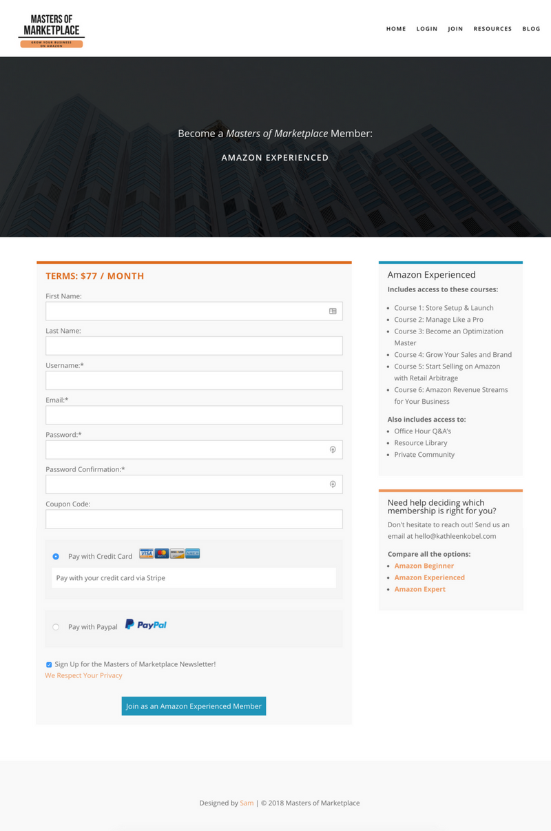
You’ve got the visitor to the signup page. Now, they’re going to have to hand over the dough in order to get the keys to the space. They can still turn back or exit out of their browser, how oh how are you going to make sure they join before leaving?
I like to include some key items on the signup pages to remind them how this membership is going to change their life and is totally worth the monthly fee: (1) a reminder of all that is included in the membership (2) the terms to which their membership will be held to – ie: $X per month (3) an easy form with minimal entries (4) an opportunity to browse other membership options through handy links, if applicable (5) an easy payment method integrated – like stripe or paypal.
Don’t lose your members at the signup page. Keep it clean, keep it simple – but remind them why it’s so important that they become a member right now before they forget.
The signup page example is from Masters of Marketplace and includes all of the 5 key items mentioned above, in an extremely user friendly and minimally styled way (I don’t know about you – but a site’s cleanliness is a huge indicator of the leader’s organization and the quality of the product).
Related: Thank you pages! The “you just became a member, thank you!” page is so important to get your new members started on the right track within the site. This is a good place to mention the user manual and a chance to give them a video walkthrough tutorial of your site.
Login Page
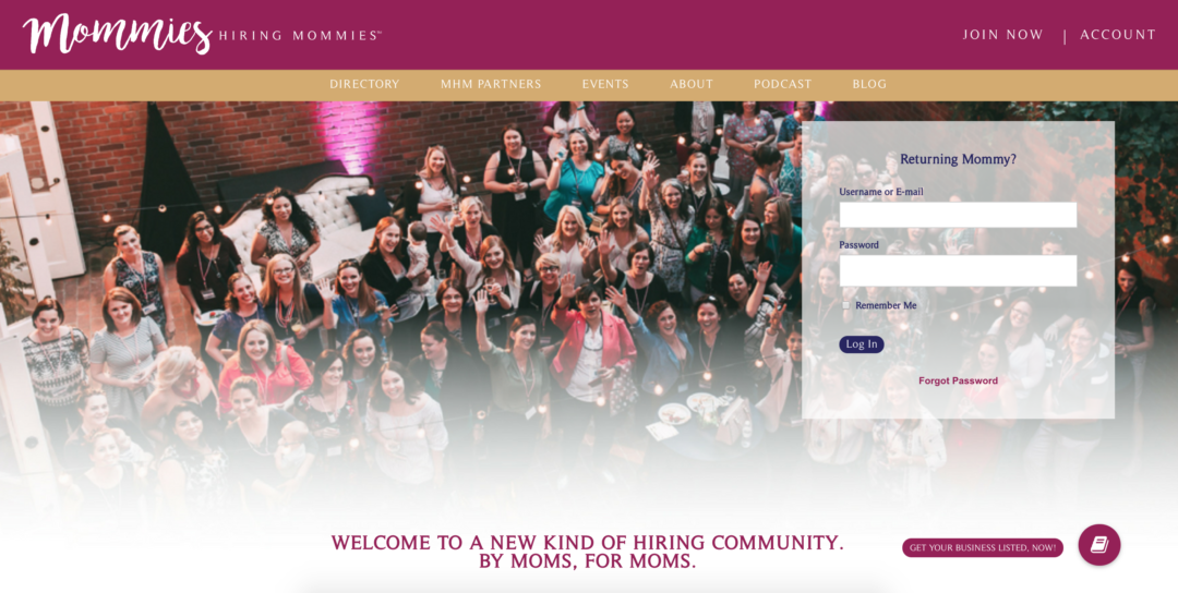
This may seem kind of obvious & irrelevant. So what, users have to sign in, who cares? But guess what – your users care! Think back to a site you’ve logged into recently that had an interesting login page. It caught your attention, right? It was enough for you to remember it right now.
The biggest hurdle with membership sites is churn rate. The a membership site specifically, curn rate is the rate at which subscribers stop being members of your site. There are many reasons users might stop being members of your site, but I see it this way, why not make every aspect of their experience incredible? Why not make them smile when they log in to your site, so maybe they’ll want to stay a while?
You can also incorporate a login bar / pop up login from the main menu, or strategically place it on the homepage for quick & easy access. With your login page you have the ability to give a new first impression every time your users sign in. (such as the first example with Mommies Hiring Mommies).
There are lots of ways you can build & style a login page – I typically like the full cover look, because it feels immersive (such as the second example, the login page for Katrina Ubell, MD’s membership site I created).
The Dashboard & “My Account”
Depending on the purpose of the site, there may or may not be a need for an official “dashboard” – but you will at the very least need a place for your users to manage their account.
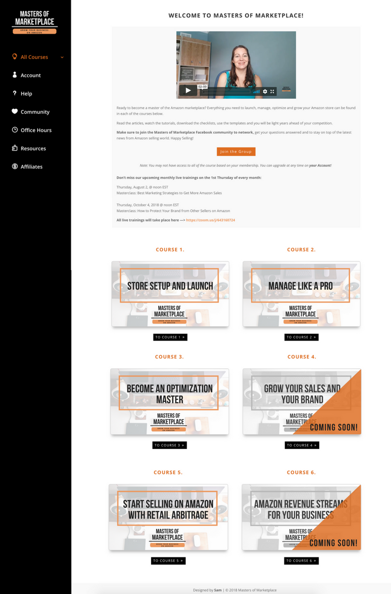
The dashboard is typically where your users will land directly after logging in. It is the hub of your membership site, the place your members will go to see any new updates and instantly access their courses / protected content. The dashboard is an opportunity to curate an experience for your users and help guide them to make the most of this space.
Keeping your dashboard fresh and current will show your users two things: that the site is ACTIVE (ie: they didn’t just join a membership and the leader disappeared) and that there is a reason to KEEP their membership – because the dashboard reminds them everything they would lose if they cancelled.
A dashboard could include so many things, and it really depends on the purpose of the site. Some items you may want to put on a dashboard:
- Links to the most important pages in the membership site
- A personalized welcome message using merge tags or shortcodes (ie: Hey, Sam! Hope your day is AWESOME!)
- A display of progress on courses, classes, lessons or modules (if you have the capability with your membership plugins or add-ons).
- A calendar of upcoming events
- A feed from your podcast or blog
Now, if you’ve realized your membership site does not need a dashboard, you do still need a “My Account” page. This is a space for your users to update their billing information, upgrade or cancel their membership, update their profile image (if applicable), interact with the personal elements of the site (ie: if they can manage any content displayed on the site). Whether or not your site has a dashboard, you need the account page – but if you are noticing that a dashboard doesn’t fit the needs of your membership space, it might make sense to immediately direct your users to their account after logging in (or, to protected content if that works better).
This example is from Masters of Marketplace. The dashboard doubles as the course hub & a spot for the leader to share updates (above – not shown in the screenshot).
FAQ / User Manual
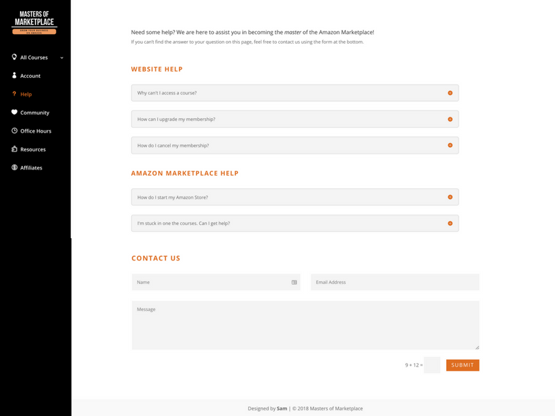
I can tell you both as the owner of a membership site & as the techie behind many, many membership sites for my clients – your users will have questions. I typically take the questions (especially the very common ones) and use those comments to update the workflow for my members.
However, there are some questions that cannot necessarily be used to implement changes, and will require answers. The FAQ / User Manual page is your best friend.
The user manual can serve as a guide for you users, showing them what all the features are and how to use them. Teaching them how they can upgrade their account (you want to let them know so they’ll do it!!) and even how to cancel (even if you don’t want them to).
If you’re stuck with what questions to put on your FAQ for your brand new membership site, here are some to start with:
- Why can’t I access something? (the answer might be that they need to join / upgrade their membership)
- How can I upgrade my account?
- How can I cancel my account?
- Do you have an affiliate program?
Then, as your users start interacting with your site, you’ll be able to grow this FAQ / user manual repository of questions and answers to fully guide your members.
Protected Content
Ahhh, the protected content pages – the heart and soul of the membership site. These are the good that your users pay for – the content they can only access once they pay for their own set of keys.
Knowing what kind of content you want to protect is only step one. Things you can protect (with all of my top 3 membership plugins) include:
- Pages
- Posts
- Courses / Lessons
- Media files (pdfs, images, videos)
- Extra features
Once you decide what content to protect, it’s time to think about the structure and organization – which seriously, is an entire topic of its own.
Some quick things to determine: are there “main” sections that can be protected, under which everything else lies (ie: parent / child pages)? are there courses that have submodules that can be broken up?
From experience, it’s not only easier to setup but also substantially easier to maintain when protection occurs at a top level – ie: parent pages and then protection flow through to the child pages.
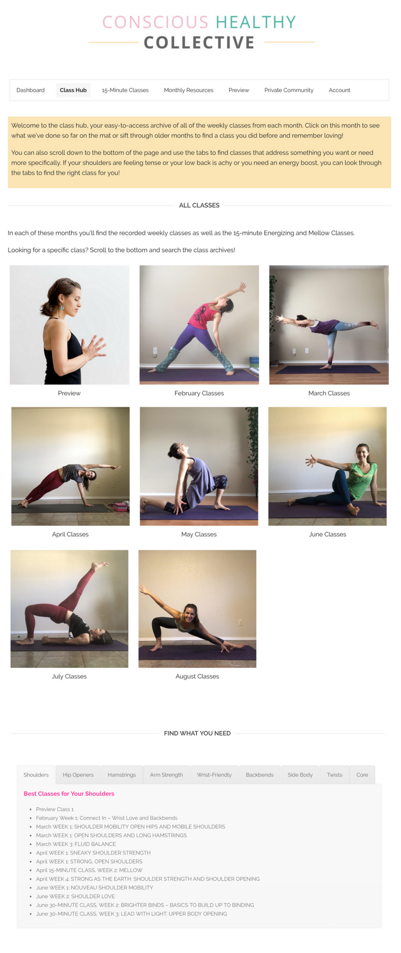
A perfect example is the way we built and structured the Conscious Healthy Collective. This is a membership site with yoga classes, lessons, downloadables, etc. For her monthly courses we created a main, protected page (parent) and then each individual month becomes a sub-page (child) of the main hub. It’s easy to organize and so simple to grow – because the protection never needs to be adjusted!
We dig in deep to this structural organization & scalability in my Membership Mechanics course, which I highly recommend if you want to build a membership site that will grow with ease.
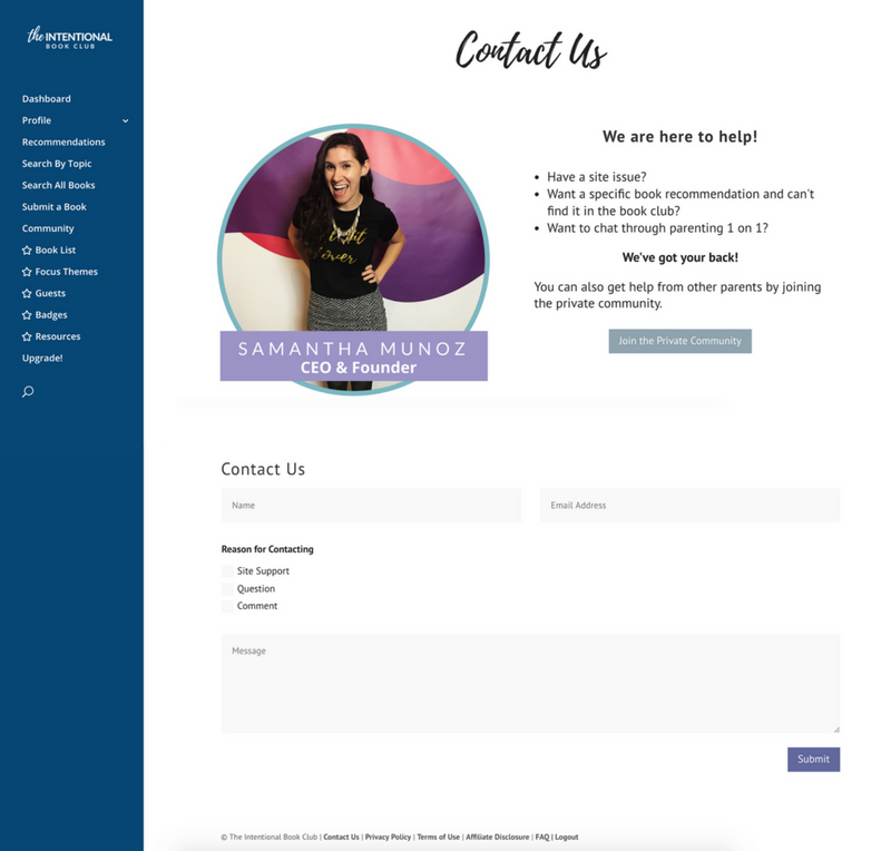
Contact Form
As mentioned above, despite your best efforts, users will inherently have questions regarding the membership site. Typical questions you’ll see come through:
- Why don’t I have access to X on the site?
- How do I upgrade my membership?
- How do I cancel my membership?
Even though these questions are answered on the FAQ, just expect them to come through your contact form. The contact form is super important for the membership site – you want to know of tech issues or if a user has a suggestion.
I prefer having a contact form SPECIFICALLY for the membership site to help keep things organized on the back end.

Get Nerdy about Business, Websites & Tech with Us!
The Making Website Magic Community (hosted on Mighty Networks!) is a place where women web designersand developers can meet, mingle and make meaningful connections with industry collaborators. See you inside!

Article by
Sam Munoz
Sam is the CEO and lead web developer of Sam Munoz Consulting, LLC. Through years of coding, development & design experience - she is all about simplicity, minimalism & making websites that align with her client's business models & goals.
Keep Learning & Reading
How to Add a Top Call to Action Bar in WordPress
A top call to action bar can be a great way to easily direct visitors to convert. Learn how to add a Top Bar Call to Action in Wordpress
How to Position a Background Image in Divi
Ensure the background image you use on your site shows up the way you want it to! Learn how to position a background image in Divi.
How to Add reCAPTCHA to the Divi Contact Form Module
Stop spam in its tracks! Learn how to add reCAPTCHA to the Divi Contact Form module.